App design - Angelika Brand Illustrator UI / UX Designer from Munich

Project overview

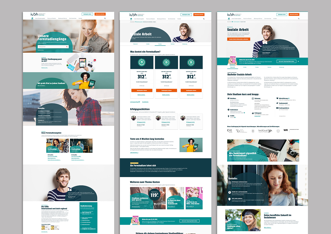
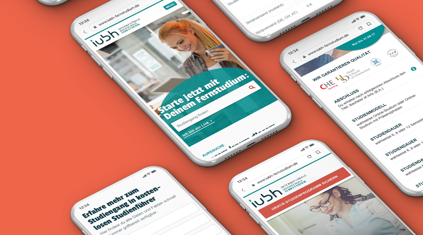
IUBH started as an on-campus university in Bad Honnef. A few years later, the distance learning program was launched, and the dual study program was added. All products operated as separate brands with their own color schemes. A mobile site existed, but it was clear that the design focus was on the desktop version. Since the layout had become outdated, the entire brand was to be rebuilt.

Redesign
UX Concept
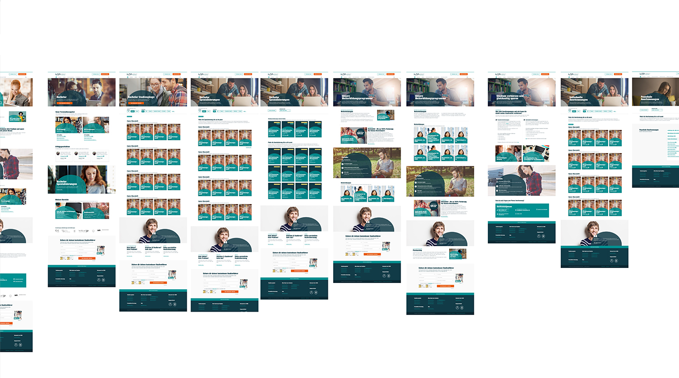
Wireframes
User Flow

Project Details

Role:

Design Lead

Duration:

6 months

Tools:

Sketch, Figma, Pen & Paper, Miro

Interviews, analytics & surveys

We first analyzed the Google Analytics data. It became clear how different the target audiences were. For the on-campus study program, 80%* of users were on desktop, while 75%* of the distance learning users accessed the site via mobile devices. We decided to use the distance learning program as a pilot for the redesign because it had the largest user group and allowed for quick and flexible testing.
Problem Tab Image
We first analyzed the Google Analytics data. It became clear how different the target audiences were. For the on-campus study program, 80%* of users were on desktop, while 75%* of the distance learning users accessed the site via mobile devices. We decided to use the distance learning program as a pilot for the redesign because it had the largest user group and allowed for quick and flexible testing.

Results from Interviews and Surveys
#1: Distance learning is not real study:
Many had prejudices against distance learning and preferred on-campus study. They feared that a distance degree would be worthless.

#2: I'm all alone:
For many, distance learning meant "I'm studying alone, I can't ask anyone, no one will help me."

#3: I'm afraid of being overwhelmed:
Another concern was workload. When you work 40 hours a day, it can be daunting to study afterward.

Problem Tab Image

User-centered design

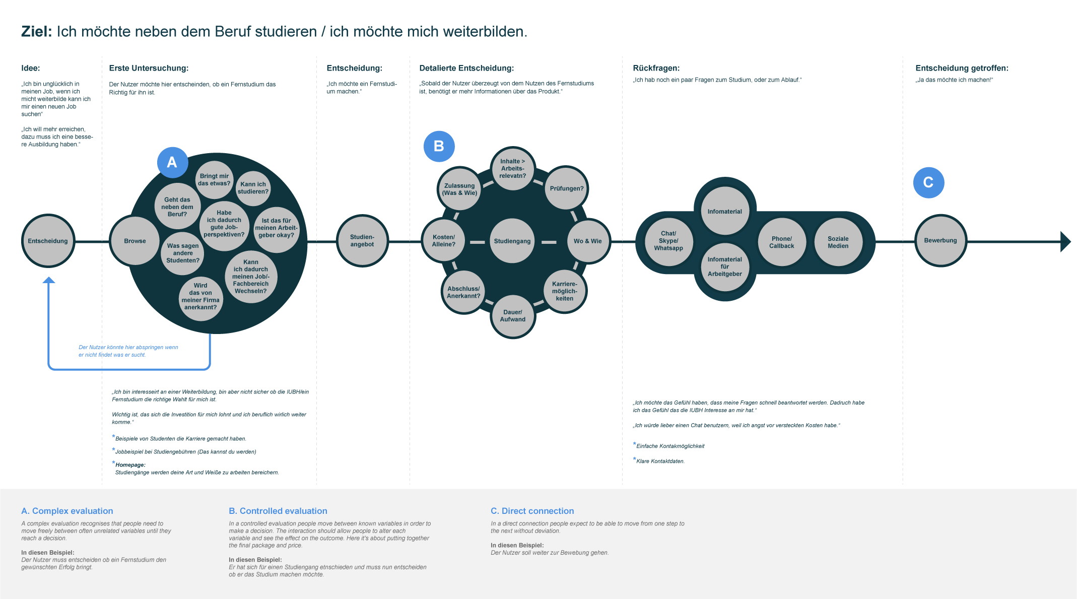
To visualize the steps a user takes when deciding to enroll in a distance learning program, we created a task model during a workshop.
App Design for Recipe App - Angelika Brand Illustrator UI / UX Designer from Munich

Information architecture

Based on insights gained from the initial content audits, competitor analysis, and card sorting with potential users, I defined the sitemap for IUBH and then evaluated it through tree testing with potential users.

With this groundwork completed, I was able to start working on the wireframes.
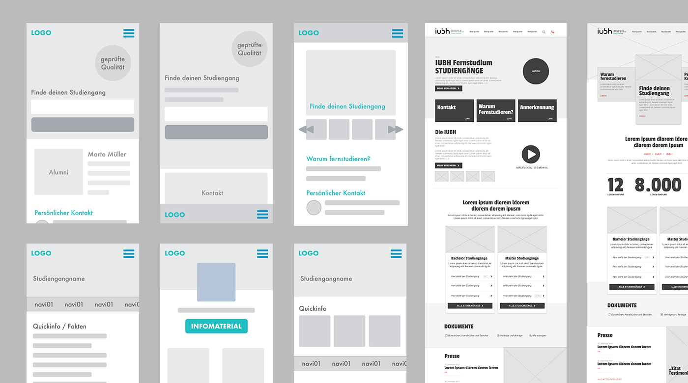
App Design for Recipe App - Angelika Brand Illustrator UI / UX Designer from Munich

Prototypes, User Tests, and A/B Tests

After several mid- and high-fidelity prototypes quickly assembled in Marvel, we began further user testing. We had already tested the old site in parallel. Based on these tests, we were able to start our first tests.
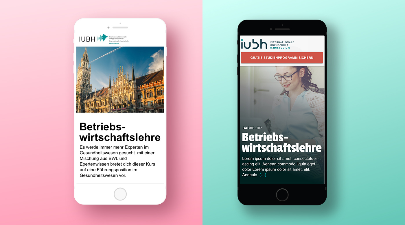
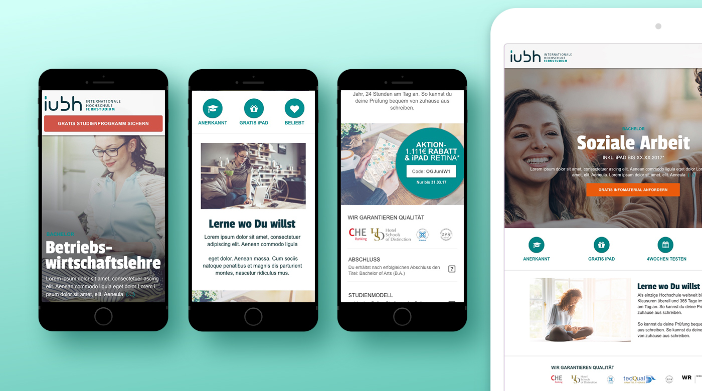
Tiny Meals 3 - Angelika Brand Illustrator UI / UX Designer from Munich
User flow Tiny Meals - Angelika Brand Illustrator UI / UX Designer from Munich

Visual design

I started by adjusting existing elements in the design.
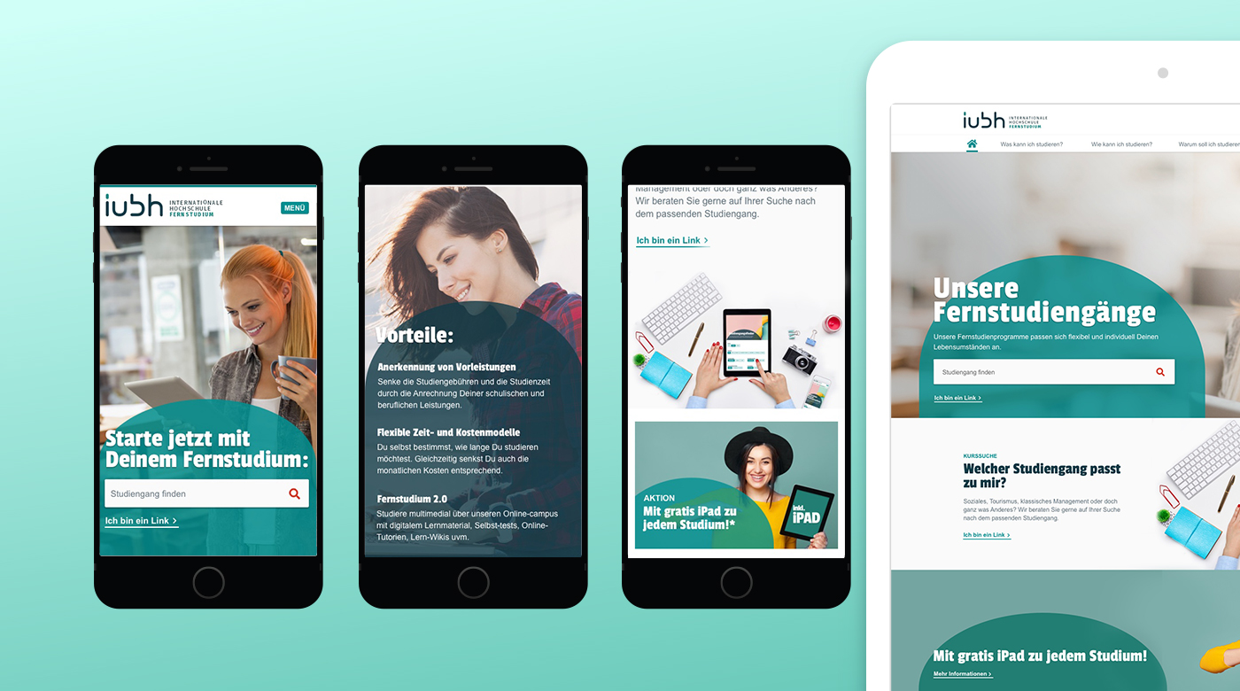
App Design for Recipe App - Angelika Brand Illustrator UI / UX Designer from Munich

Design system

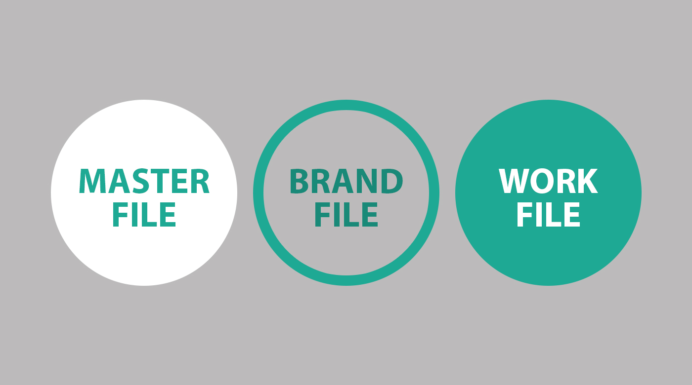
Since the brands were essentially differentiated only by colors, I decided to structure them in 3 steps:

Master file
Definitions / Components / Guidelines

Brand file
Each brand has its own file / Style overrides / Imagery / Additional components

Work file
Concepts / Layouts / Visions
Tiny Meals 3 - Angelika Brand Illustrator UI / UX Designer from Munich
User flow Tiny Meals - Angelika Brand Illustrator UI / UX Designer from Munich

Learnings

Design system I learned a lot from this project, especially about design systems and how to create them effectively for teams. There are many things I would optimize in hindsight.

Time & imagery Creating the right imagery took an enormous amount of time, and in hindsight, it’s something that requires dedicated project time.

Let ideas go faster I had too specific an idea of what the outcome should look like, and had to adjust it based on user tests. In my next project, I would start with a minimum viable product and build on it step by step.

*All data shown are examples. These are not the actual data of the university due to privacy reasons.