New development of a design system for Figma

Project Image

Project:

I developed a scalable design system that ensures consistent and efficient implementation across various projects.

Challenge:

There are many design systems, but few that truly impress in quality and scalability.

Outcome:

Through the development of this system, I became a Figma hacker, delivering creative solutions in record time.
Highlights of my design system

Project Image

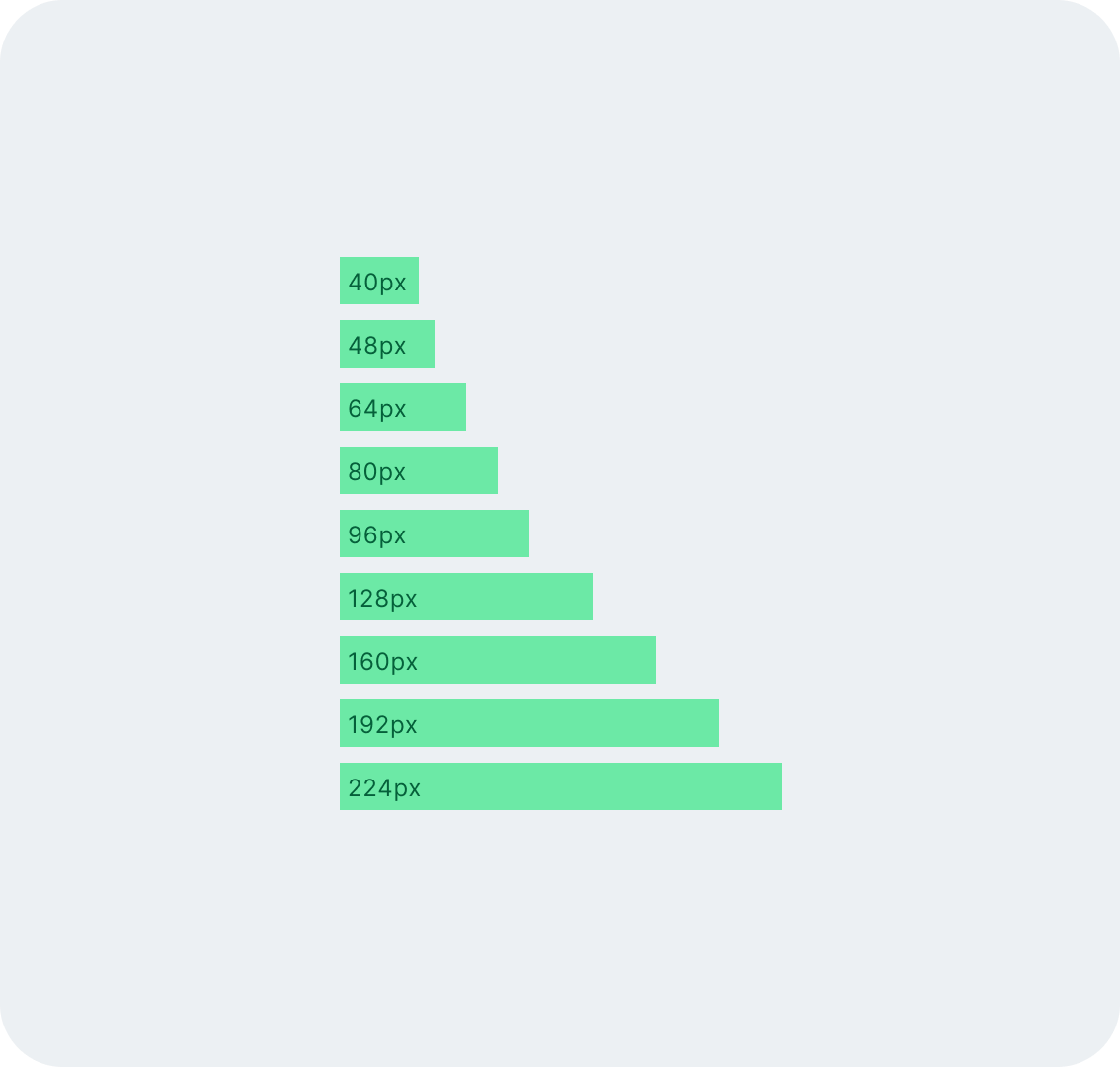
4px spacing and Grid System

The 4px spacing system ensures clean, consistent layouts and facilitates the creation of harmonious designs.

Project Image

Optimal typography hierarchy

Clear rules for font sizes and spacing improve readability and structure in every design.

Project Image

Quick adjustments with design tokens

The system uses design tokens, allowing for rapid global adjustments without needing to rework the entire design.

Project Image

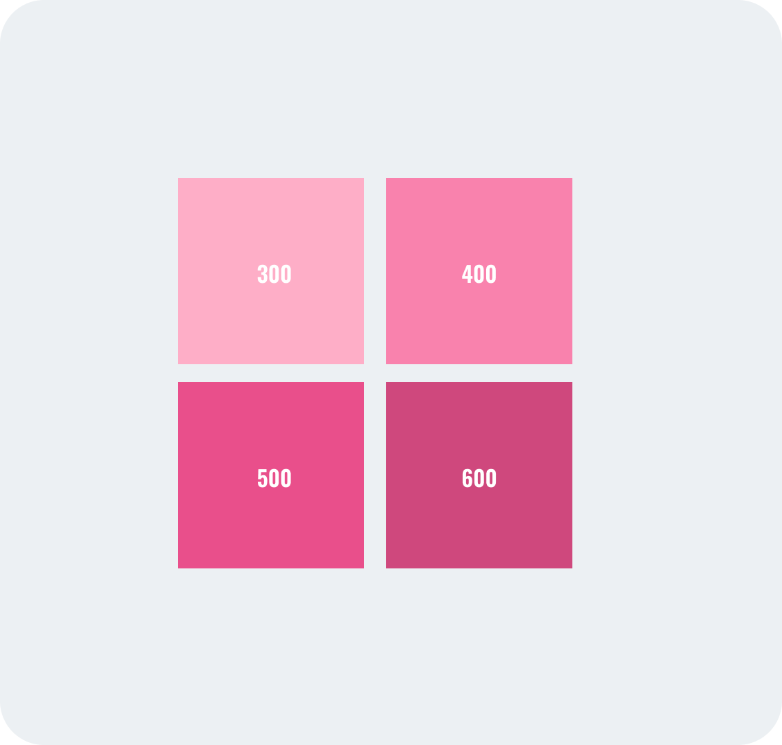
Comprehensive color palette

The carefully developed color palette strengthens brand identity and ensures the design remains both aesthetic and functional.

Project Image

Maximizing Figma's potential

I leveraged Figma to its full potential, ensuring maximum flexibility and fast adjustments.

Project Image

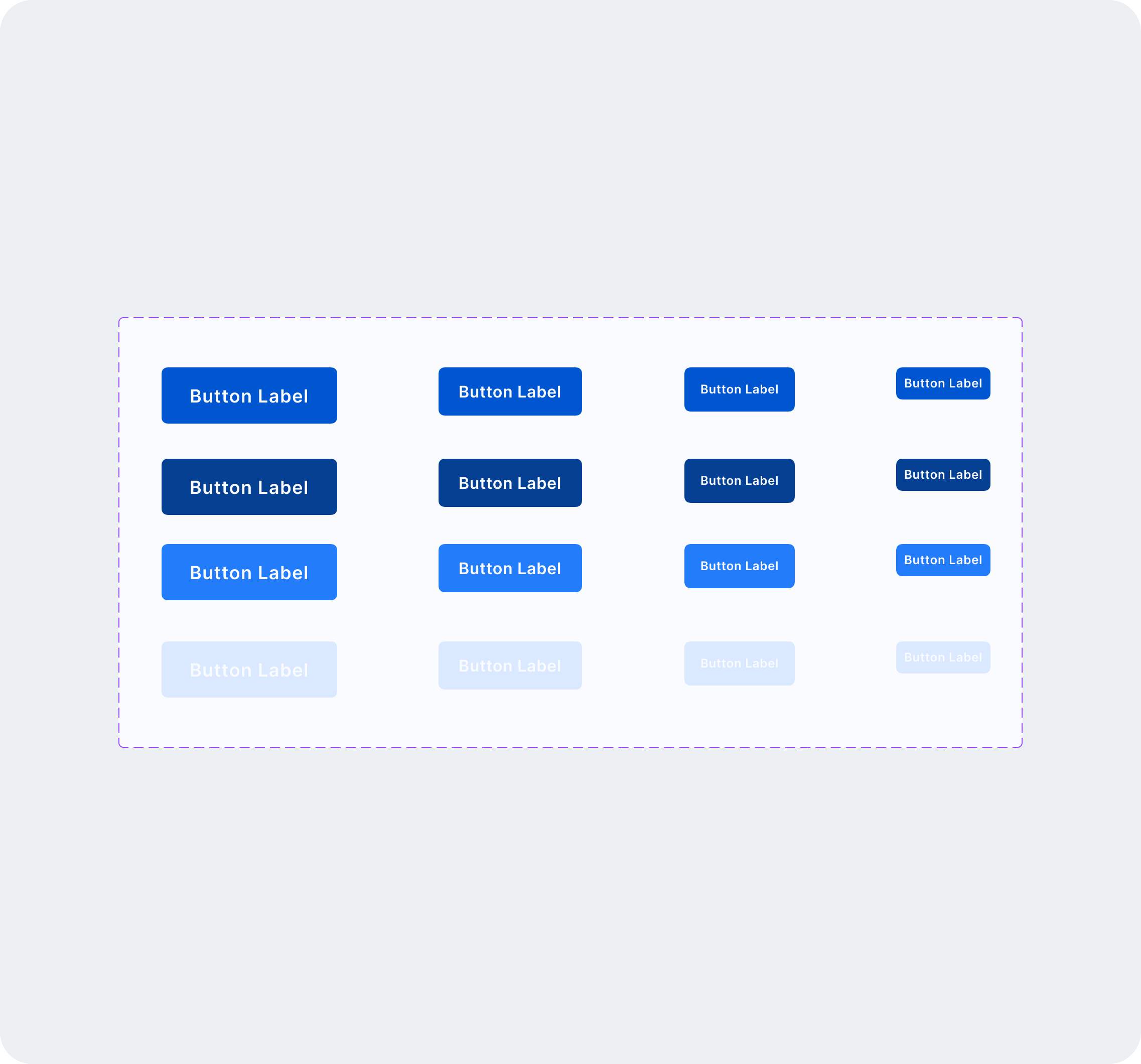
Consistent UI components

Buttons, forms, and navigation elements are standardized, accelerating the design and development processes.

Demo of the base file


Interested?
Feel free to contact me if you would like to see the entire file.